
Color in the Garden
COLOR is a controversial subject. To us, color like religion, is a personal matter. Probably no two people see color alike, and most of the theories of color harmony cannot be easily applied in the garden. “Color is the one experience in life that requires no conscious struggle of the intellect to appreciate,” says the famous color authority, Faber Birren.
We believe that other elements provide a more lasting effect in gardens than color. Color is transient and capricious; a satisfying pattern, a good background, adequate termination, a focal point of importance, and well-placed masses of foliage develop a garden picture that is pleasing through twelve months of the year. Still we are only reflecting the times, if we are responsive to color, now important in almost every human activity.
The most common theory of color harmony is based on the mixture of pigments. This is not helpful to the gardener because it does not take into consideration the visual aspects of color. Another theory based on the spectrum and the length of light waves is not applicable to the garden, where color must be considered in relation to environment. The “psychological theory” of Faber Birren is the only one related to gardening. It is based on the effect or sensation of color on the eye. For a more detailed discussion of this see Birren’s Color Dimensions, Color Equation, and the comprehensive color charts in The American Colorist. We present here, in black and white, Mr. Birren’s Rational Color Chart which has been balanced in accordance with visual and psychological laws of color. (Plate 14.)
Since the effect of color is largely psychological, and since it is influenced, as it appears in the garden, by light, shadow, climate, and humidity, it is nearly impossible to lay down rules for its use. To discuss color, we must settle on a few definitions. The nomenclature at best is confused. Musical terms – key, pitch, and scale – though often used, do not accurately describe color and should be discarded in favor of terms which belong to color alone. There are not many of these.
The primaries are the four pure invariable colors – red, yellow, green, and blue, to which Faber Birren adds black and white as did Leonardo da Vinci who wrote, “The first of all simple colors is white, though philosophers will not acknowledge either black or white to be colors; because the first is the cause, or receiver of colors, the other totally deprived of them. But as painters cannot do without either, we shall place them among the others; and according to this order of things, white will be first, yellow second, green third, blue the fourth, red the fifth, and black the sixth. We shall set down white for the representative of light, without which no color can be seen; yellow for the earth; green for the water; blue for the air; red for fire; and black for total darkness.”
It is important to note that this list of primaries differs from the usual theories of color taught in school in which either red, yellow, and blue or red, green, and blue-violet are considered the primary colors.
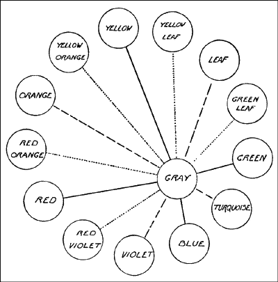
Plate 14. The Rational Color Circle
Hue is an inclusive term for either a primary, secondary, or other color.
A pure tint is a hue combined with white but no black.
A shade is a hue in combination with black but no white. Tints are therefore of light value, and shades of darker value.
Chroma, an attribute of hue, is the strength of the color- its intensity or purity, whether it is clear, strong, vigorous, or weak and approaching neutral gray. Tints and shades of low chroma have both white and black in their composition. They are not pure colors. (They are the grayed colors of some systems.) Color, then is pure – hue; with black – shade; with white – tint; and with both black and white – tone.
Color is not the beginning and end of gardening. It is only one means of creating fine compositions. It must be considered along with other principles employed to create a successful artistic expression. It is not a thing apart. Color should be used to provide accent and emphasis, balance, repetition and rhythm, sequence, and climax. These are more helpful in the development of a pleasing garden than all the subtle, close, color harmonies that ever were attempted.
Simplicity of effect is always important. Because we are unable to control the effects of sunlight and shadow, and must always take into consideration the competition of green in the surrounding landscape, and blue in the overarching sky, color in the garden cannot be used the same way as in the other arts. All the niceties of close color harmonies, the split compliments, triads, and tetrades of flower arrangement mean little in the immensity of out of doors. When these are attempted in garden planting, the effect is usually only a quaint conceit. In her one-color fidelity, Nature is like the famous fireman who didn’t care what color they painted the fire wagon so long as it was red. Nature’s color is definitely green.
Another difference from flower arrangement lies in the fact that in gardening you can rarely work with a plant in flower, but must create a real composition in the mind or on paper, and only later assemble the plants. Therefore most work with color in the garden must be a matter of rules, the copying of existing successful compositions, or perhaps trial and error. Many disappointments occur because of faulty nomenclature and the lack of a generally accepted color chart.
Colorists have always found inspiration in nature. Birren remarked that: “She is versatile as an artist, bold in some moods, subtle in others. She combines hues in contrast and analogy. While she isn’t always a lady of refinement, her wantonness has a sure and voluptuous appeal. Color in nature is vigorous and lucid. It offers a wealth of ideas.”
Among his “pertinent observations” is this: “Analogy (likeness) is the first natural principle of color harmony. The hues of the rainbow run adjacently through red, orange, yellow, blue, violet. The colors of autumn blend through green, yellow-green, yellow, orange, red, violet. The petals of a red rose will appear orange in highlight and purple in shadow. Iridescence in a peacock feather and the wings of some insects will swing from green at one angle to blue at another and purple at still another. Water will appear green, turquoise-blue, violet in various depths and movements.” All these natural phenomena show color harmony by analogy. Such schemes have a refined beauty.
When she chooses, Nature combines opposite or nearly opposite hues in a startling manner. She thinks nothing of creating blue or purple flowers with orange or yellow centers. She veins the underside of blue-green rose leaves with red. Her blue, butterflies and birds often have yellow on them. These harmonies by contrast are sharply dramatic.
Nature uses few hues. She cleverly seeks variety with a few colors, usually two to a flower. Green is, of course, the commonest of all colors followed in turn, by yellow, blue-violet, and red-violet. Even the sky is seldom pure blue but more often greenish, yellowish, gray, or purple. At times it is even orange or scarlet. Atmospheric haze drawn across her palette softens everything and brings it into harmony.
The single color scheme, therefore, is unnatural, since it is too limited in scope. Schemes based on pastel colors lack vitality. The modern approach to color is bolder. Contemporary gardeners crave color in large masses and in forceful combinations. They depend not so much on subtlety as on imagination, initiative, and fearlessness. In any case, colors must be blended, graded, focused, and varied according to light and shade so as to supplement and strengthen the design of a garden, and not only for a short period but through the season.
- Color Accent – Color accent groups along a border produce movement, rhythm, and sequence. They carry the eye along to the climactic point.
- Color Placement – Color, for any given season, should never be concentrated in any one bed or border to the exclusion of others.
- Color Schemes – Since we discourage the use of restrictive and complex color schemes, we will offer other reasonable solutions. The two methods that follow have been found in actual practice to produce satisfactory gardens.
- Blue – Analogous harmonies based on blue are easy to arrange because dark and light blues provide sufficient contrast. Blue, contrasted with yellow or orange of the same chroma, is strong and bold, but such combinations must be used sparingly.
- Violet, Purple, and Magenta – These hues lie between blue and red and are most difficult to use effectively. Long considered symbols of loyalty, they bring dignity to the garden.
- Red, and Its Place – Red, and the closely associated hues of crimson, scarlet, and red-orange can be important in a garden composition. Too often they are omitted altogether, but they are a means of securing greater distinction and a desirable warmth.
- Pink, a Tint of Red – Here is a color that is not a primary, as is sometimes supposed, but a tint of red that varies according to the amount of white it contains. There are deep strong pinks (rose), or pale weak ones.
- Orange, Warm and Luminous – Orange imparts even more brilliance and warmth to borders than red and closely related scarlet. Orange is one of the vital hues.
- Yellow for Light and Life – Yellow and white are always pleasing together and there is a fresh simplicity in their use. Another strong contrast may be had from strong yellow with strong blue, or even with difficult purple.
- White, the Fifth Primary – You might think white would be the simplest of colors to use in the garden, yet this is not the case. White, improperly placed, or in poor proportion causes unsatisfactory compositions.
- Green, the Sixth Primary – The urge for riots of color in all parts of the garden at all times makes us overlook green. Such neglect not only impairs the true effectiveness of color compositions, but also robs the garden of more permanent beauty.
- Gray and Silvery Foliage – Gray-foliaged plants are more effective with light-tinted flowers, soft lavenders, mauve, pale yellow, buff, and soft pinks. But they are also good with strong colors.
- Color in the Garden – Color should be used to provide accent and emphasis, balance, repetition and rhythm, sequence, and climax. These are more helpful in the development of a pleasing garden than all the subtle, close, color harmonies that ever were attempted.
- ext Page: Color Accent
- Return from Color in the Garden to: Landscape-Guide Home
Please tell us what you think about this page. (E-mail addresses are kept in complete confidence).